About Ebykr
Ebykr celebrates classic and vintage lightweight bicycles through provocative imagery and opinion. Ride along with us.
About Ebykr
Ebykr celebrates classic and vintage lightweight bicycles through provocative imagery and opinion. Ride along with us.
Source: Gallica (Bibliothèque nationale de France), L'Officiel du cycle, du motocycle et du camping, 20 September 1952, Numéro spécial du Salon 1952, page 153; ark:/12148/bd6t541820671. Source gallica.bnf.fr / BnF.
| Marque | Packson |
|---|---|
| Type | Advertisement |
| Year | 1952 |
| Publisher | Les Forges du Lignon |
| Country | France |
| Language | French |
| Pages | 1 |
| Source | Gallica (Bibliothèque nationale de France), L'Officiel du cycle, du motocycle et du camping, 20 September 1952, Numéro spécial du Salon 1952, page 153; ark:/12148/bd6t541820671. Source gallica.bnf.fr / BnF. |
| Credit | Ebykr archive; Bibliothèque nationale de France |
| Identifier | Gallica (BnF) ark:/12148/bd6t541820671/f153 |
| Transcription | Transcribed by eye |
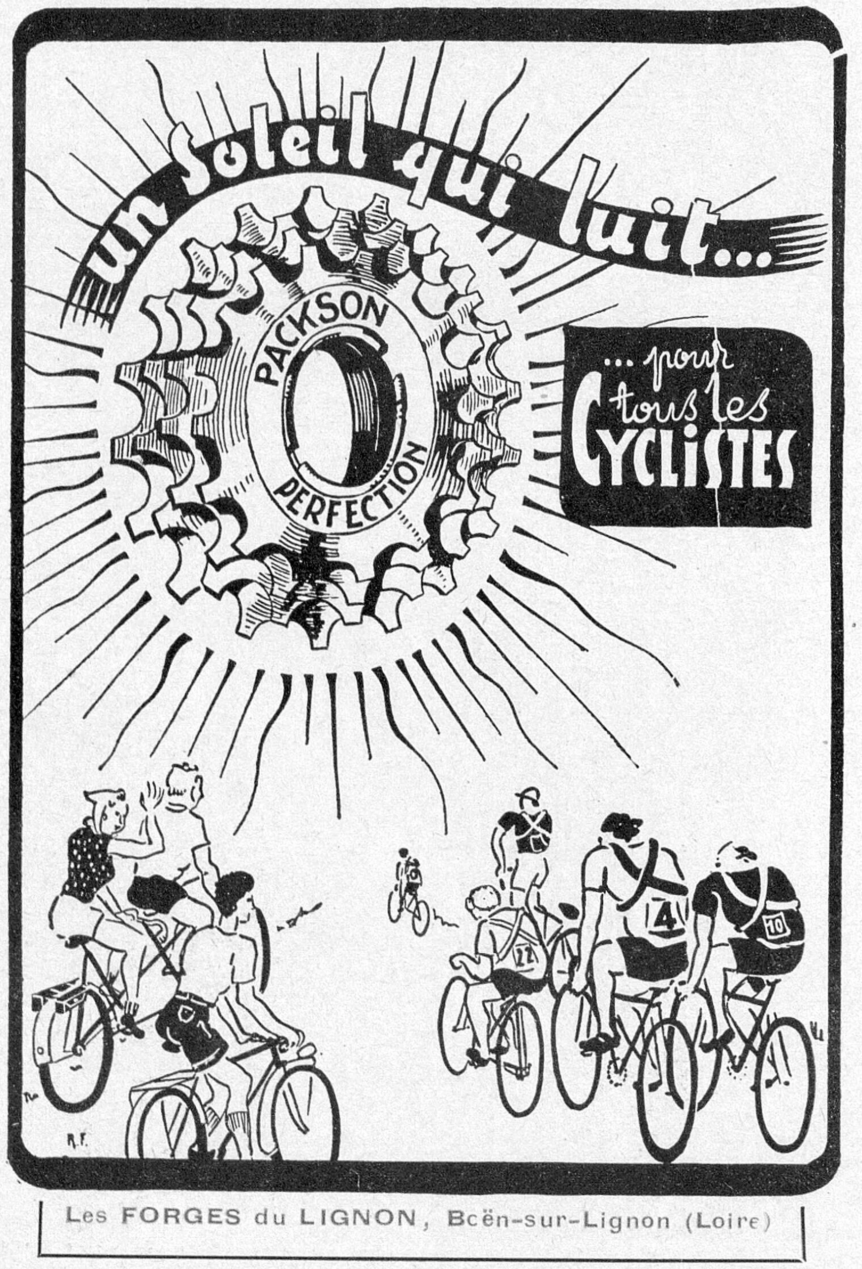
un Soleil qui luit... PACKSON PERFECTION ... pour tous les CYCLISTES Les FORGES du LIGNON, Boën-sur-Lignon (Loire)
— Page 1 —
un Soleil qui luit…
PACKSON
PERFECTION
… pour tous les CYCLISTES
Les FORGES du LIGNON, Boën-sur-Lignon (Loire)
[An upright advertisement inside a thick black rule with rounded corners, printed in black line on the untinted paper with one line in red at the foot, below the rule and inside a second thin rectangle of its own. The whole panel is a pen drawing. A single freewheel sprocket is drawn very large in the upper half, seen face on with its teeth in bold outline and its body shaded with fine hatching, the hub bore left as a black ring; the two trade words are lettered in open capitals that curve round the sprocket, one above the bore and one below it, with a ring of dots between them. Long straight rays of varied length radiate from the sprocket to every edge of the panel, so that the wheel reads as a sun. Across the head a wide ribbon bends from the left edge to the right and carries the opening phrase in a heavy brush script reversed out in white, the end of the ribbon breaking into parallel strokes. At the upper right a solid black panel with rounded corners holds the second phrase in three lines of white brush lettering, the last word much the largest. Along the foot two groups of cyclists are drawn in loose cartoon line against the bare paper: at the left a touring party of four on laden machines with saddlebags and mudguards, one rider waving, a woman among them; at the right a group of five racing men in jerseys and crash hats, three of them carrying numbered back plates, with a lone rider small in the middle distance between the two groups. The firm’s name and town are set at the very foot in red letter-spaced sans-serif capitals and lower case. A small signature of two capitals with periods, read as “R. F.”, stands on the paper at the lower left between the touring group and the rule, and a second small mark of two strokes, too coarse to read, sits above it against the left rule. The “o” of the town name is broken in printing and reads almost as a “c”.]
[This advertisement shares page 153 of L’Officiel du cycle with advertisements for Selatex, F. Durand and Cholain, each held here as its own record.]
Ebykr presents this material for research and education. If you hold rights to it or notice an ownership issue, please contact us and we will respond promptly.
The Ebykr Digest
New articles, timelines, catalog finds and registry activity — assembled from the archive once a month. Your address is never shared.
Double opt-in. One email per month. Unsubscribe at any time with one click.