About Ebykr
Ebykr celebrates classic and vintage lightweight bicycles through provocative imagery and opinion. Ride along with us.
About Ebykr
Ebykr celebrates classic and vintage lightweight bicycles through provocative imagery and opinion. Ride along with us.
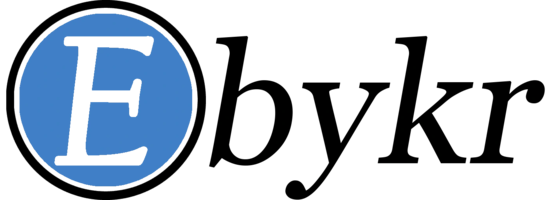
Source: Gallica (Bibliothèque nationale de France), L'Officiel du cycle, du motocycle et du camping, 1 October 1955, N° 20, page 208; ark:/12148/bd6t54207485x. Source gallica.bnf.fr / BnF.
| Marque | JB |
|---|---|
| Type | Advertisement |
| Year | 1955 |
| Publisher | Jean Baron |
| Country | France |
| Language | French |
| Pages | 1 |
| Source | Gallica (Bibliothèque nationale de France), L'Officiel du cycle, du motocycle et du camping, 1 October 1955, N° 20, page 208; ark:/12148/bd6t54207485x. Source gallica.bnf.fr / BnF. |
| Credit | Ebykr archive; Bibliothèque nationale de France |
| Identifier | Gallica (BnF) ark:/12148/bd6t54207485x/f206 |
| Transcription | Transcribed by eye |
Jean BARON Maison fondée en 1918 Place de la Périvaure FRAISSES (Loire) Luxe J.B Ses marques Grand luxe MYLORD — sont une garantie — Jeux de direction - Jeux de pédalier, tous modèles pour cycles et cyclomoteurs Axes et cuvettes de pédalier pour réparations Axes de moyeux gros et petits cônes Vente exclusive aux constructeurs …
— Page 1 —
Jean BARON
Maison fondée en 1918
Place de la Périvaure
FRAISSES (Loire)
Luxe
J.B
Ses
marques
Grand luxe
MYLORD
— sont une garantie —
Jeux de direction – Jeux de pédalier, tous modèles
pour cycles et cyclomoteurs
Axes et cuvettes de pédalier pour réparations
Axes de moyeux gros et petits cônes
Vente exclusive aux constructeurs et grossistes
[A ruled advertisement in black and white, set entirely in type with no photograph or drawing, enclosed in a single rule. The proprietor’s name “Jean BARON” fills the head in very heavy, tightly set condensed capitals and lowercase. Below it a small line gives the founding year, with the last figure printed in slightly broken type, and an italic address line follows. A band of fine vertical hatching runs across the full width as a divider. Two brand names are each framed in a thin outline diamond: “J.B” in heavy roman letters at the left under the label “Luxe”, and “MYLORD” in bold serif capitals at the right under “Grand luxe”, with the words “Ses marques” stacked between them. A lightface italic line set between dashes and underlined follows, then three centered lines of text in a bold sans-serif separated by black dots. A double rule closes the panel above the last line, a bold condensed sentence about the trade, running the width of the foot. No artist signature or agency mark is visible, and no text from the reverse of the leaf shows through.]
[This advertisement shares page 208 of L’Officiel du cycle with an advertisement for Eberlein, held here as its own record, and others for Cie des Pompes et Distributeurs and Jolly et Cie.]
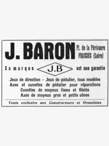 JB June 1951 Advertisement — Headsets, Pedal Sets, Axles and Cups for Constructors and Wholesalers
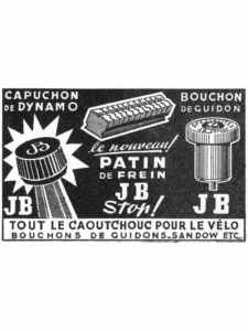 JB November 1951 Advertisement — The JB Stop Brake Block and All the Rubber for the Bicycle
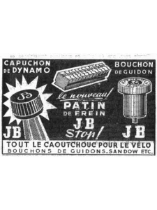 JB 1952 Advertisement — The JB Stop Brake Block and Every Rubber Part
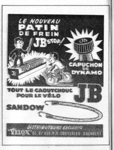 JB 1955 Advertisement — The JB Stop Brake Block and All the Rubber for the Bicycle
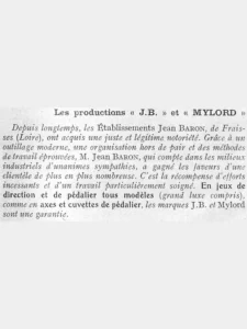 Les jeux de direction J.B et Mylord — L’Officiel du cycle, 1 October 1955, Headsets, Pedal Axles and Cups
Ebykr presents this material for research and education. If you hold rights to it or notice an ownership issue, please contact us and we will respond promptly.
The Ebykr Digest
New articles, timelines, catalog finds and registry activity — assembled from the archive once a month. Your address is never shared.
Double opt-in. One email per month. Unsubscribe at any time with one click.