About Ebykr
Ebykr celebrates classic and vintage lightweight bicycles through provocative imagery and opinion. Ride along with us.
About Ebykr
Ebykr celebrates classic and vintage lightweight bicycles through provocative imagery and opinion. Ride along with us.

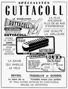
Source: Gallica (Bibliothèque nationale de France), L'Officiel du cycle, du motocycle et du camping, 20 September 1952, Numéro spécial du Salon 1952, page 170; ark:/12148/bd6t541820671. Source gallica.bnf.fr / BnF.
| Marque | Guttacoll |
|---|---|
| Type | Advertisement |
| Year | 1952 |
| Publisher | Spécialités Guttacoll |
| Country | France |
| Language | French |
| Pages | 1 |
| Source | Gallica (Bibliothèque nationale de France), L'Officiel du cycle, du motocycle et du camping, 20 September 1952, Numéro spécial du Salon 1952, page 170; ark:/12148/bd6t541820671. Source gallica.bnf.fr / BnF. |
| Credit | Ebykr archive; Bibliothèque nationale de France |
| Identifier | Gallica (BnF) ark:/12148/bd6t541820671/f170 |
| Transcription | Transcribed by eye |
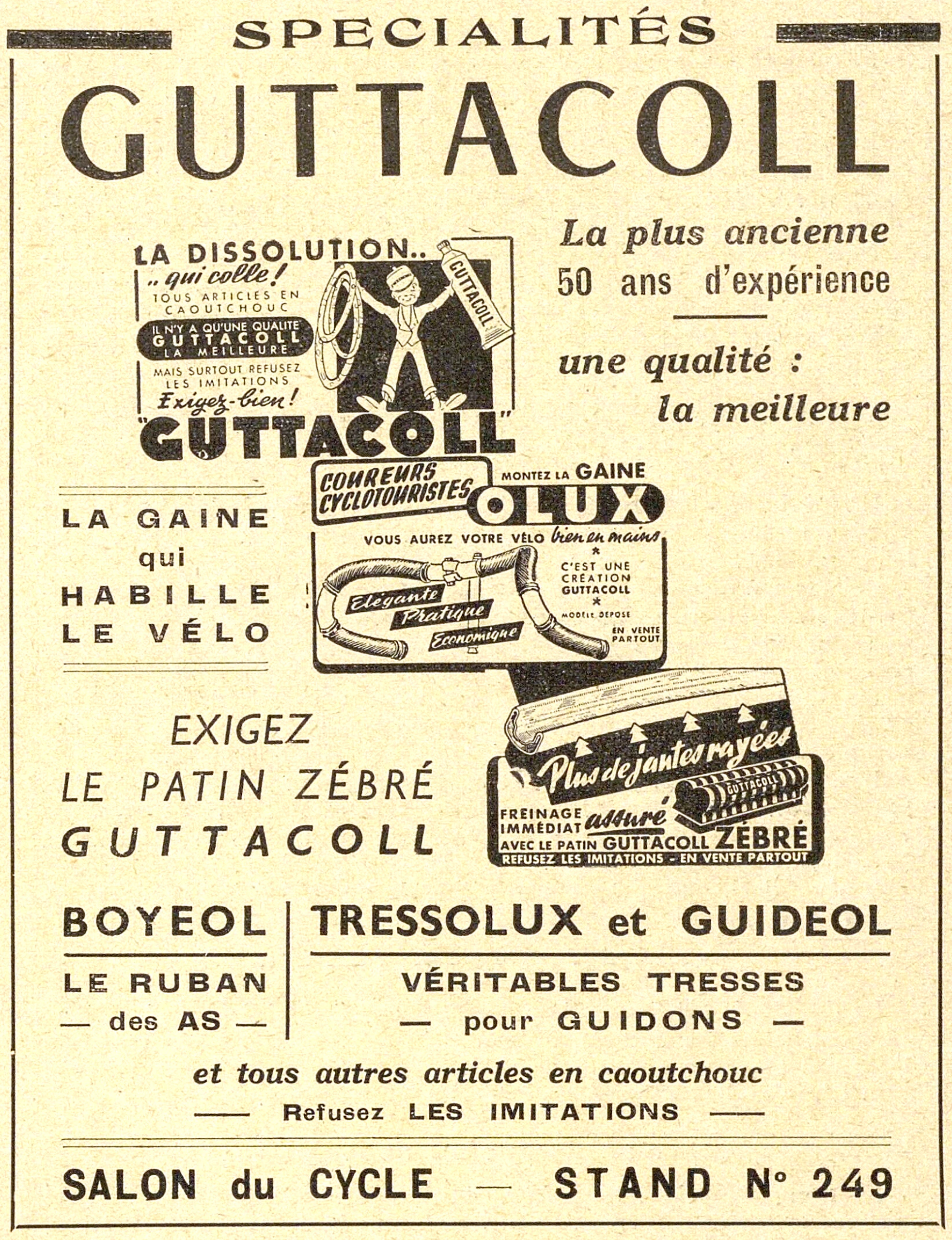
SPECIALITÉS GUTTACOLL LA DISSOLUTION.. .. qui colle ! TOUS ARTICLES EN CAOUTCHOUC IL N'Y A QU'UNE QUALITE GUTTACOLL LA MEILLEURE MAIS SURTOUT REFUSEZ LES IMITATIONS Exigez-bien ! " GUTTACOLL " La plus ancienne 50 ans d'expérience une qualité : la meilleure LA GAINE qui HABILLE LE VÉLO COUREURS CYCLOTOURISTES MONTEZ LA GAINE OLUX VOUS AUREZ …
— Page 1 —
SPECIALITÉS
GUTTACOLL
LA DISSOLUTION..
.. qui colle !
TOUS ARTICLES EN
CAOUTCHOUC
IL N’Y A QU’UNE QUALITE
GUTTACOLL
LA MEILLEURE
MAIS SURTOUT REFUSEZ
LES IMITATIONS
Exigez-bien !
” GUTTACOLL ”
La plus ancienne
50 ans d’expérience
une qualité :
la meilleure
LA GAINE
qui
HABILLE
LE VÉLO
COUREURS
CYCLOTOURISTES
MONTEZ LA GAINE
OLUX
VOUS AUREZ VOTRE VÉLO bien en mains
*
C’EST UNE
CRÉATION
GUTTACOLL
*
MODELE DEPOSE
EN VENTE
PARTOUT
Elégante
Pratique
Economique
EXIGEZ
LE PATIN ZÉBRÉ
GUTTACOLL
Plus de jantes rayées
FREINAGE
IMMÉDIAT assuré
AVEC LE PATIN GUTTACOLL ZÉBRÉ
REFUSEZ LES IMITATIONS – EN VENTE PARTOUT
GUTTACOLL
BOYEOL | TRESSOLUX et GUIDEOL
LE RUBAN | VÉRITABLES TRESSES
– des AS – | – pour GUIDONS –
et tous autres articles en caoutchouc
– Refusez LES IMITATIONS –
SALON du CYCLE – STAND N° 249
[A full-page advertisement in black on cream, framed by a single rule, crowded with three reproduced showcard panels among blocks of display type. The trade name heads the page in enormous light sans serif capitals, with “SPECIALITÉS” above it in bold letter-spaced capitals flanked by two short solid bars, the first E of that word set without its accent. At the upper left a showcard is reproduced in line engraving: a cartoon boy in a peaked cap, a bow tie and wide trousers stands against a solid black ground with his arms thrown up, holding two tubular tire casings in his left hand and a large tube of the solution lettered down its body in his right, his feet drawn in white against the black. Round him the card’s wording runs in hand-lettered sans serif, one line reversed out of a black rounded tablet, with the trade name very large in heavy shaded capitals between quotation marks across the foot. At the upper right four lines of a light sloping italic make the age-and-quality claim, divided by a short rule. In the middle a second showcard shows a dropped handlebar drawn in open line engraving with hatched shading, both bends and the stem sheathed in the sleeve, three sloping black tablets across it carrying the words of praise in a white script, the brand name reversed out of a long black rounded shape at the top with the O drawn as a large ring, and the small print stacked in a column at the right. The left margin beside it carries the sleeve slogan in four lines of bold letter-spaced capitals between rules, and below that a three-line call for the brake block in light sans serif capitals. The third showcard, at the lower right, shows a brake block and shoe drawn in line engraving at a slant above a black panel, four white chevrons pointing up at it, the headline running across in a white brush script and a second drawing at the right showing the ribbed striped block lettered with the trade name. The lower part of the page is ruled into two compartments for the tape and the handlebar braid, each name in heavy sans serif capitals over its description, and the page closes with one italic line, a line about imitations and a bold rule above the hall and stand number set in large sans serif capitals. No second color, no agency mark and no artist’s signature appear.]
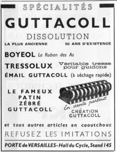
[This advertisement shares page 170 of L’Officiel du cycle with advertisements for Pivo, Fourets and R.F.G., each held here as its own record.]
Ebykr presents this material for research and education. If you hold rights to it or notice an ownership issue, please contact us and we will respond promptly.
The Ebykr Digest
New articles, timelines, catalog finds and registry activity — assembled from the archive once a month. Your address is never shared.
Double opt-in. One email per month. Unsubscribe at any time with one click.