About Ebykr
Ebykr celebrates classic and vintage lightweight bicycles through provocative imagery and opinion. Ride along with us.
About Ebykr
Ebykr celebrates classic and vintage lightweight bicycles through provocative imagery and opinion. Ride along with us.
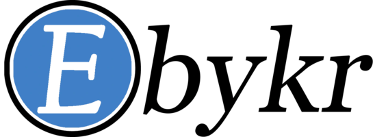
Source: Gallica (Bibliothèque nationale de France), L'Officiel du cycle, du motocycle et du camping, 1 November 1952, N° 44, page 52; ark:/12148/bd6t54182075k. Source gallica.bnf.fr / BnF.
| Marque | J. Baron |
|---|---|
| Type | Advertisement |
| Year | 1952 |
| Publisher | Jean Baron |
| Country | France |
| Language | French |
| Pages | 1 |
| Source | Gallica (Bibliothèque nationale de France), L'Officiel du cycle, du motocycle et du camping, 1 November 1952, N° 44, page 52; ark:/12148/bd6t54182075k. Source gallica.bnf.fr / BnF. |
| Credit | Ebykr archive; Bibliothèque nationale de France |
| Identifier | Gallica (BnF) ark:/12148/bd6t54182075k/f52 |
| Transcription | Transcribed by eye |
Jean BARON Maison fondée en 1918 Place de la Périvaure FRAISSES (Loire) J.B Ses marques MYLORD — sont une garantie — Jeux de direction - Jeux de pédalier, tous modèles pour cycles et cyclomoteurs Axes et cuvettes de pédalier pour réparations Axes de moyeux gros et petits cônes Vente exclusive aux constructeurs et grossistes
— Page 1 —
Jean BARON
Maison fondée en 1918
Place de la Périvaure
FRAISSES (Loire)
J.B Ses marques MYLORD
— sont une garantie —
Jeux de direction – Jeux de pédalier, tous modèles
pour cycles et cyclomoteurs
Axes et cuvettes de pédalier pour réparations
Axes de moyeux gros et petits cônes
Vente exclusive aux constructeurs et grossistes
[A ruled advertisement in black and white inside a thin border, text only. The firm’s name “Jean BARON” fills the head in very heavy condensed sans-serif type, with “BARON” larger and blacker than “Jean”. Beneath it the foundation year and the address are set in small roman and italic lines. A band of fine vertical hatching runs across the panel as a divider. Below it two lozenge outlines flank a short centered caption: on the left the initials “J.B” in a heavy italic roman inside a lozenge, on the right the word “MYLORD” in small capitals inside a longer lozenge, and between them the words “Ses marques” stacked in bold type. A line of italic type underlined by a rule, set between two short dashes, follows. The product lines are centered in condensed sans-serif type of different sizes and are separated by two solid round bullets. A double rule closes the list above a final line in heavy condensed type. No drawing and no signature are visible.]
[This advertisement shares page 52 of L’Officiel du cycle with advertisements for Dilecta and Helyett, each held here as its own record, and one for Agent M. Dutac.]
 J. Baron April 1951 Advertisement — J.B Headsets, Bottom-Bracket Sets, Pedal Axles and Hub Parts
 J. Baron November 1951 Advertisement — J.B and Mylord Headsets, Bottom Brackets and Cones
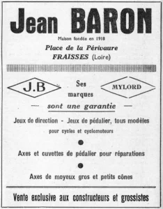 J. Baron 1953 Advertisement — J.B and Mylord Headsets, Bottom Brackets and Hub Parts
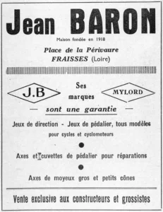 J. Baron 1954 Advertisement — J.B and Mylord Headsets and Bottom-Bracket Sets
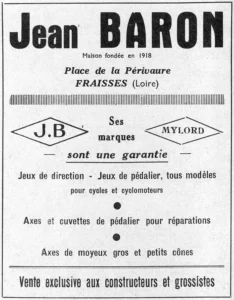 J. Baron October 1954 Advertisement — J.B and Mylord Headsets and Bottom-Bracket Sets, Axles and Cones
Ebykr presents this material for research and education. If you hold rights to it or notice an ownership issue, please contact us and we will respond promptly.
The Ebykr Digest
New articles, timelines, catalog finds and registry activity — assembled from the archive once a month. Your address is never shared.
Double opt-in. One email per month. Unsubscribe at any time with one click.