About Ebykr
Ebykr celebrates classic and vintage lightweight bicycles through provocative imagery and opinion. Ride along with us.
About Ebykr
Ebykr celebrates classic and vintage lightweight bicycles through provocative imagery and opinion. Ride along with us.
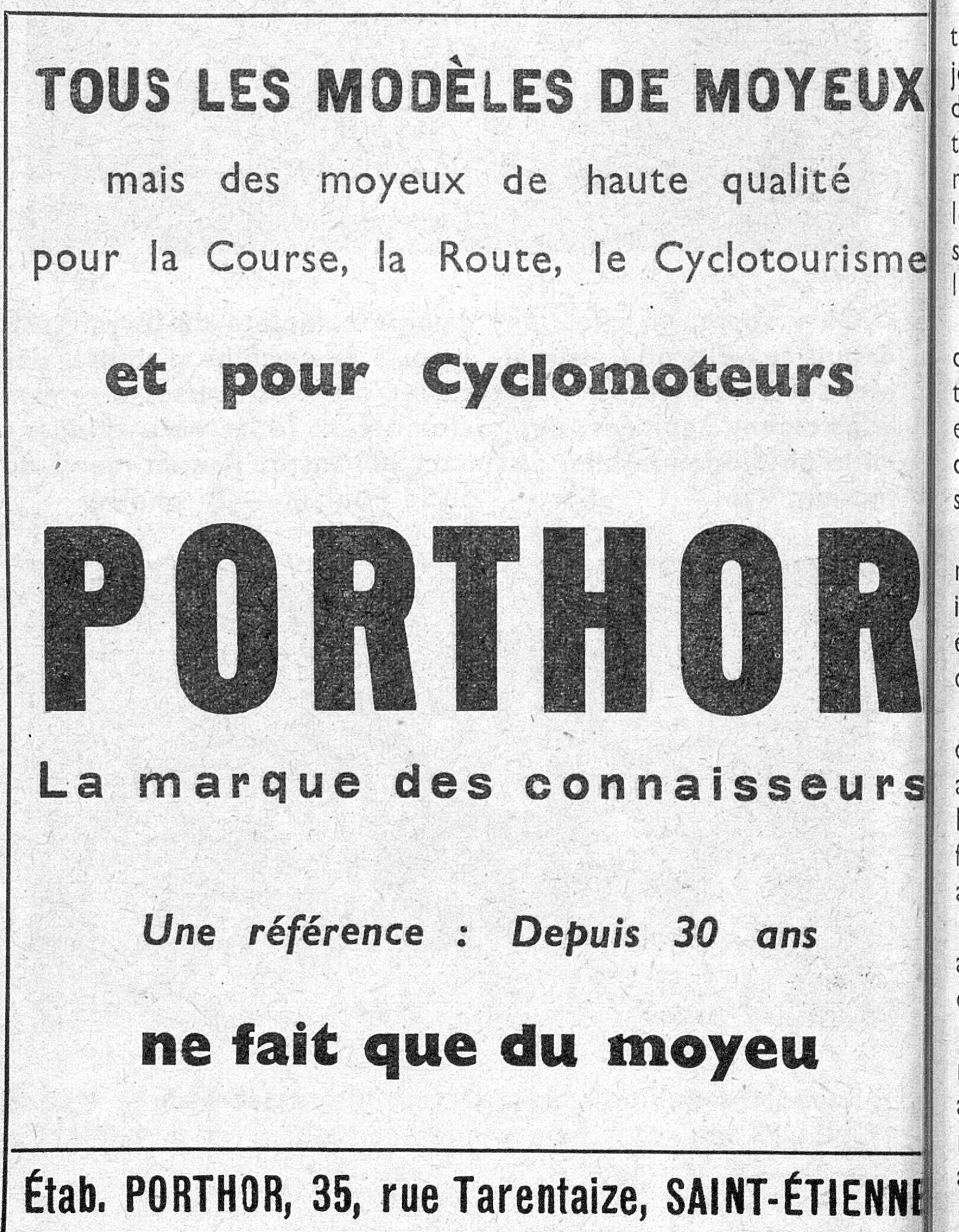
Source: Gallica (Bibliothèque nationale de France), L'Officiel du cycle, du motocycle et du camping, 2 October 1954, N° 40, page 128; ark:/12148/bd6t54206310j. Source gallica.bnf.fr / BnF.
| Marque | Porthor |
|---|---|
| Type | Advertisement |
| Year | 1954 |
| Publisher | Établissements Porthor |
| Country | France |
| Language | French |
| Pages | 1 |
| Source | Gallica (Bibliothèque nationale de France), L'Officiel du cycle, du motocycle et du camping, 2 October 1954, N° 40, page 128; ark:/12148/bd6t54206310j. Source gallica.bnf.fr / BnF. |
| Credit | Ebykr archive; Bibliothèque nationale de France |
| Identifier | Gallica (BnF) ark:/12148/bd6t54206310j/f127 |
| Transcription | Transcribed by eye |
TOUS LES MODÈLES DE MOYEUX mais des moyeux de haute qualité pour la Course, la Route, le Cyclotourisme et pour Cyclomoteurs PORTHOR La marque des connaisseurs Une référence : Depuis 30 ans ne fait que du moyeu Étab. PORTHOR, 35, rue Tarentaize, SAINT-ÉTIENNE
— Page 1 —
TOUS LES MODÈLES DE MOYEUX
mais des moyeux de haute qualité
pour la Course, la Route, le Cyclotourisme
et pour Cyclomoteurs
PORTHOR
La marque des connaisseurs
Une référence : Depuis 30 ans
ne fait que du moyeu
Étab. PORTHOR, 35, rue Tarentaize, SAINT-ÉTIENNE
[A ruled advertisement in black and white, text only, with no drawing or photograph. The top line, “TOUS LES MODÈLES DE MOYEUX”, is set in heavy condensed sans-serif capitals across the full width. Below it two lines of light lowercase roman type are widely letterspaced, then “et pour Cyclomoteurs” follows in a bold, rounded slab-serif lowercase. The name “PORTHOR” fills the middle of the panel in very large, solid, condensed sans-serif capitals running from edge to edge. Under it “La marque des connaisseurs” is set in wide-spaced bold sans-serif, then a line in bold italic sans-serif, and “ne fait que du moyeu” in a heavy rounded lowercase face. A ruled line closes the panel, and beneath it the firm’s name and address appear in one line of bold condensed capitals. The last letter of “SAINT-ÉTIENNE” is partly cut off by the column rule at the right edge. A strip of text from the neighboring column shows along the right side. No artist signature or agency mark is visible.]
[This advertisement shares page 128 of L’Officiel du cycle with an advertisement for Ktema, held here as its own record, and one for Verdier rectifiers and battery chargers.]
Ebykr presents this material for research and education. If you hold rights to it or notice an ownership issue, please contact us and we will respond promptly.
The Ebykr Digest
New articles, timelines, catalog finds and registry activity — assembled from the archive once a month. Your address is never shared.
Double opt-in. One email per month. Unsubscribe at any time with one click.