About Ebykr
Ebykr celebrates classic and vintage lightweight bicycles through provocative imagery and opinion. Ride along with us.
About Ebykr
Ebykr celebrates classic and vintage lightweight bicycles through provocative imagery and opinion. Ride along with us.

Source: Gallica (Bibliothèque nationale de France), L'Officiel du cycle, du motocycle et du camping, 2 October 1954, N° 40, page 173; ark:/12148/bd6t54206310j. Source gallica.bnf.fr / BnF.
| Marque | A.R.O. |
|---|---|
| Type | Advertisement |
| Year | 1954 |
| Publisher | Établissements Gros |
| Country | France |
| Language | French |
| Pages | 1 |
| Source | Gallica (Bibliothèque nationale de France), L'Officiel du cycle, du motocycle et du camping, 2 October 1954, N° 40, page 173; ark:/12148/bd6t54206310j. Source gallica.bnf.fr / BnF. |
| Credit | Ebykr archive; Bibliothèque nationale de France |
| Identifier | Gallica (BnF) ark:/12148/bd6t54206310j/f172 |
| Transcription | Transcribed by eye |
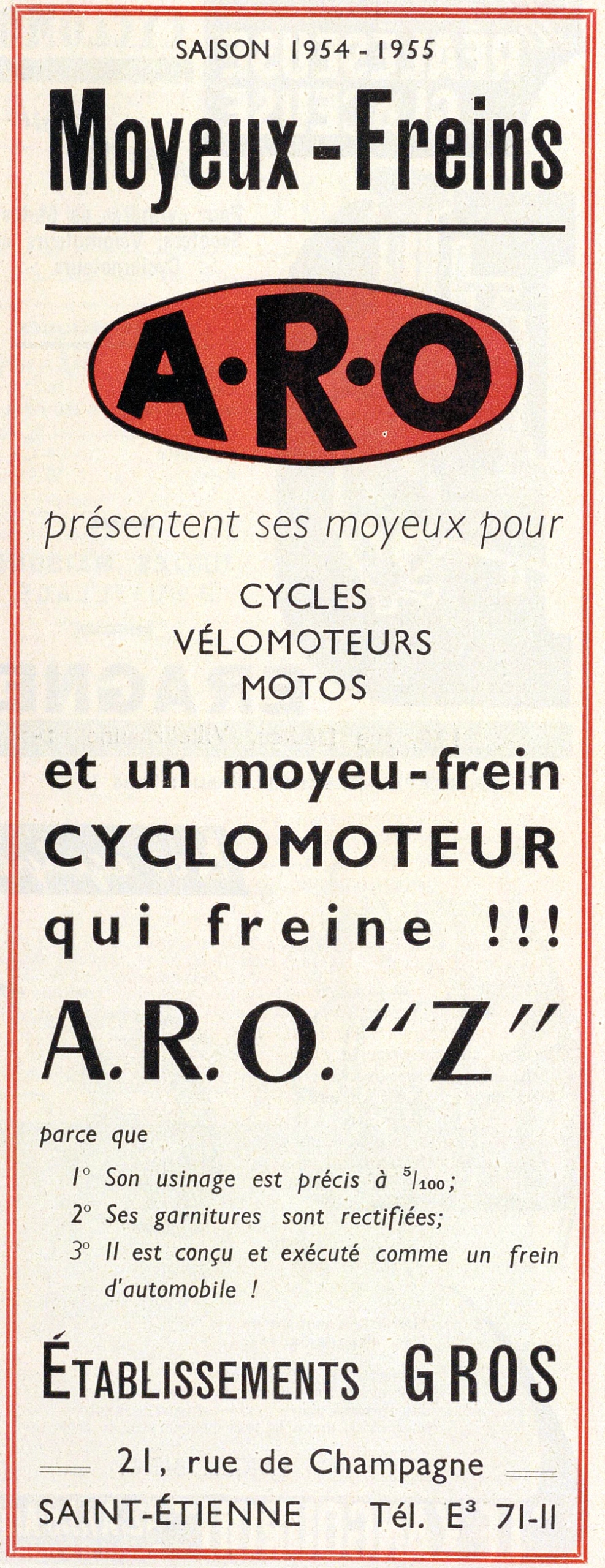
SAISON 1954 - 1955 Moyeux-Freins A·R·O présentent ses moyeux pour CYCLES VÉLOMOTEURS MOTOS et un moyeu-frein CYCLOMOTEUR qui freine !!! A.R.O. "Z" parce que 1° Son usinage est précis à 5/100; 2° Ses garnitures sont rectifiées; 3° Il est conçu et exécuté comme un frein d'automobile ! ÉTABLISSEMENTS GROS 21, rue de Champagne SAINT-ÉTIENNE Tél. …
— Page 1 —
SAISON 1954 – 1955
Moyeux-Freins
A·R·O
présentent ses moyeux pour
CYCLES
VÉLOMOTEURS
MOTOS
et un moyeu-frein
CYCLOMOTEUR
qui freine !!!
A.R.O. “Z”
parce que
1° Son usinage est précis à 5/100;
2° Ses garnitures sont rectifiées;
3° Il est conçu et exécuté comme un frein
d’automobile !
ÉTABLISSEMENTS GROS
21, rue de Champagne
SAINT-ÉTIENNE Tél. E³ 71-11
[A ruled advertisement, text only, enclosed in a double frame of thin red lines on cream stock. At the top the line “SAISON 1954 – 1955” is set in letterspaced black sans-serif capitals, and below it “Moyeux-Freins” stands in very large heavy condensed black type over a thick black rule. Beneath the rule the initials “A·R·O” appear in heavy black capitals with a raised dot between the letters, inside a solid red oval outlined in black. Under the oval a line in light italic sans-serif and three centered lines of black capitals list the kinds of machine. A three-line block in bold black sans-serif follows, with the word “CYCLOMOTEUR” in capitals and the last line widely spaced and ending in three exclamation marks. Below it “A.R.O. “Z”” is set very large in black roman capitals. Three numbered reasons in italic sans-serif follow a short lead-in line. The firm name “ÉTABLISSEMENTS GROS” is set in tall condensed black capitals, with the first word in smaller capitals after a large initial. The street address, city and telephone number close the panel in black sans-serif, the street line flanked by two short double rules. There are no drawings or photographs and no signature.]
[This advertisement shares page 173 of L’Officiel du cycle with an advertisement for Fonlupt, held here as its own record.]
Ebykr presents this material for research and education. If you hold rights to it or notice an ownership issue, please contact us and we will respond promptly.
The Ebykr Digest
New articles, timelines, catalog finds and registry activity — assembled from the archive once a month. Your address is never shared.
Double opt-in. One email per month. Unsubscribe at any time with one click.