About Ebykr
Ebykr celebrates classic and vintage lightweight bicycles through provocative imagery and opinion. Ride along with us.
About Ebykr
Ebykr celebrates classic and vintage lightweight bicycles through provocative imagery and opinion. Ride along with us.

Source: Gallica (Bibliothèque nationale de France), L'Officiel du cycle, du motocycle et du camping, 20 September 1952, Numéro spécial du Salon 1952, page 169; ark:/12148/bd6t541820671. Source gallica.bnf.fr / BnF.
| Marque | Stark |
|---|---|
| Type | Advertisement |
| Year | 1952 |
| Publisher | Éts J. B. Chénet |
| Country | France |
| Language | French |
| Pages | 1 |
| Source | Gallica (Bibliothèque nationale de France), L'Officiel du cycle, du motocycle et du camping, 20 September 1952, Numéro spécial du Salon 1952, page 169; ark:/12148/bd6t541820671. Source gallica.bnf.fr / BnF. |
| Credit | Ebykr archive; Bibliothèque nationale de France |
| Identifier | Gallica (BnF) ark:/12148/bd6t541820671/f169 |
| Transcription | Transcribed by eye |
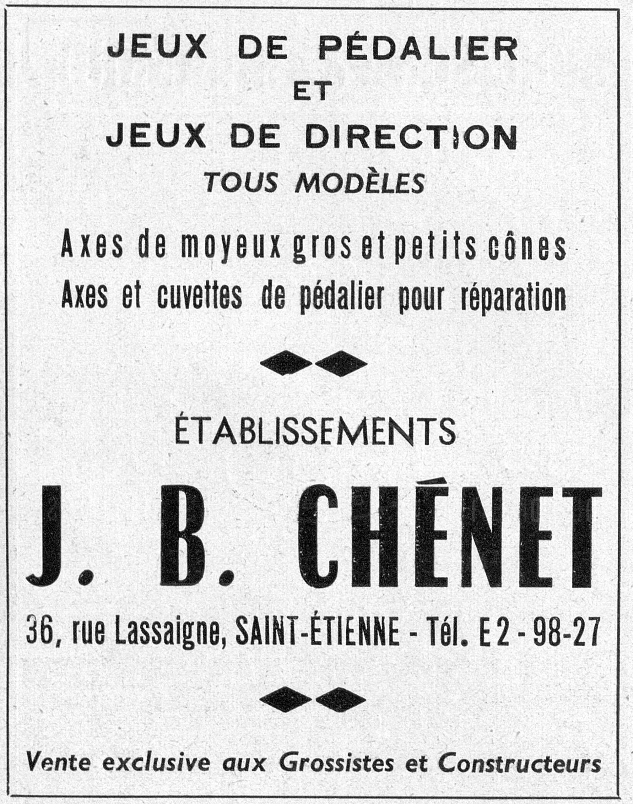
JEUX DE PÉDALIER ET JEUX DE DIRECTION TOUS MODÈLES Axes de moyeux gros et petits cônes Axes et cuvettes de pédalier pour réparation ÉTABLISSEMENTS J. B. CHÉNET 36, rue Lassaigne, SAINT-ÉTIENNE - Tél. E2 - 98-27 Vente exclusive aux Grossistes et Constructeurs
— Page 1 —
JEUX DE PÉDALIER
ET
JEUX DE DIRECTION
TOUS MODÈLES
Axes de moyeux gros et petits cônes
Axes et cuvettes de pédalier pour réparation
ÉTABLISSEMENTS
J. B. CHÉNET
36, rue Lassaigne, SAINT-ÉTIENNE – Tél. E2 – 98-27
Vente exclusive aux Grossistes et Constructeurs
[An upright advertisement set in type alone, with no illustration, enclosed in a single rule. The two product headings stand at the top in bold letter-spaced sans serif capitals, joined by a small “ET” on its own line, with “TOUS MODÈLES” under them in a lighter sans serif italic. Two lines of condensed bold sans serif follow, naming the axles and cups. A pair of solid black lozenges set point to point divides the panel. “ÉTABLISSEMENTS” is set in widely letter-spaced light sans serif capitals, and the firm’s name fills the lower half in very large heavy condensed sans serif capitals. The street address, town and telephone number run on one bold line beneath, a second pair of lozenges follows, and a rule across the foot carries the trade-only line in italic. No second color, no agency mark and no artist’s signature appear.]
[This advertisement shares page 169 of L’Officiel du cycle with an advertisement for Prestine Velox repair outfits.]
Ebykr presents this material for research and education. If you hold rights to it or notice an ownership issue, please contact us and we will respond promptly.
The Ebykr Digest
New articles, timelines, catalog finds and registry activity — assembled from the archive once a month. Your address is never shared.
Double opt-in. One email per month. Unsubscribe at any time with one click.